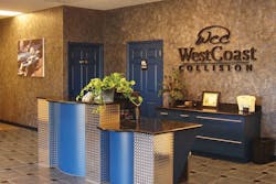
In an industrial area of Cape Coral, Fla., a strip of green grass and swaying palms leads to what looks like an oasis: West Coast Collision. Since owner Chuck Romano took over two years ago, he’s invested $2 million in a design overhaul of the 7,500-square-foot shop. Where once the front office was just a desk and a couple of stacking chairs, today’s customers walk into a chic lobby with marble floors, leather chairs, and a blue-and-chrome check-in counter with granite tops. They are offered a bottle of chilled water, mints, and the Weather Channel on the 36-inch LG TV, as well as the latest consumer magazines. A prominent photo display shows a step-by-step overview of the repair process on the immaculate shop floor. The spacious bathroom decorated with designer tile recently drew a visit from a 3M rep who announced, “I was told to look at your bathroom.”
Why all the fuss? West Coast Collision competes with 14 nearby collision repair shops, making it tough to stand out. Because customers size up a shop within the first few seconds of walking through the door, Romano figured that design could be his strongest branding statement. “Our building is our biggest marketing piece,” Romano says. “If people walk in to see a clean, professional place, they think the work you do will be just as good. If it’s filthy, they can tell the insurance company they don’t want to go there.” Romano’s shop has nine employees and does about $1.5 million in annual sales. He says West Coast Collision’s brand emphasizes cutting-edge processes (it was the first shop in Florida to use all water-borne paints), professional, reliable service and customer comfort. “You can see we’re high profile, but not so over-the-top that you’ll pay too much.”
Communicating brand through design is one of the most important steps a collision center can take to compete, says Brandon Devis, A-Plus Program Manager for Sherwin Williams Automotive Finishes Corp. A-Plus is a program for qualifying collision repair centers that offers business tools, products, training and other services to its members. “The majority of your work will come within a five- or 10-mile radius of your shop. You want to be instantly recognizable in your community.” Insurance partners also value an image and message that is consistent and professional. “Insurance companies want to partner with someone who understands that branding is important,” says Tom Hoerner, VisionPLUS program manager for automotive finishes company BASF.
Your shop’s appearance speaks for your business, and with the right approach, you can make sure the message it sends is a good one.
“Customers will make a value judgment about your shop within the first five seconds,” says Norman Angrove, senior manager of value-added programs, including the CertifiedFirst Network for PPG. He offers this checklist for the front office and repair shop:
â?’ Has this area been painted
within the last two years?
â?’ Are the magazines less than two months old?
â?’ Is it clean? How do the floors/carpets
look? How does the furniture look?
â?’ Are the bathrooms cleaned daily?
â?’ Do we offer comfortable seating?
â?’ Do we offer Wi-Fi?
â?’ What’s playing on the TV? How’s the volume?
â?’ How long does it take for the customer to
be greeted? How long does the customer wait?
â?’ Do we have designated customer parking areas?
â?’ Is our exterior, including our sign, front
entrance and parking area well-lit?
â?’ What kind of amenities do we offer in the
waiting area (i.e., beverages, food, napkins,
cups, utensils, dispensers, condiments)?
â?’ Do we have customer testimonials posted?
â?’ Are our customer service scores up to date?
â?’ Have we ever had a marketing professional
look at our colors, stationery, and signs?
â?’ Do we have lifetime warranty and
insurance company plaques displayed?
â?’ Are our work processes displayed for
the customer? Are they clear?
â?’ Is there a designated work area
for insurance appraisers?
â?’ Does our facility look like it’s able to work
on today’s complex auto technology?
â?’ Are our work materials well-organized?
â?’ Is our shop floor clean and professional looking?
What did your outside assessment reveal as strengths and weaknesses in executing your brand? If there’s a gap between where you are now and the image you want to present, what is it? What steps can you take to get there? The analysis might reveal that your brand as reflected in your design is fine, but your execution is poor. For example, you might need to delegate someone to periodically monitor and tidy the front office, or designate some new processes to follow. Or you might find, and need to correct, inconsistencies such as one logo for a uniform, another for your sign and yet another for your brochures.
But don’t think you have to get fancy. Your overall aim, Hoerner says, is to “deliver your message clearly and credibly, provide an emotional connection to your customers, motivate the buyer and create loyalty.” If a customer can see at a glance that your staff is professionally dressed in the same uniform, that your waiting area is clean and comfortable, and that plaques on the wall indicate a quality operation, your shop’s image alone has taken you halfway toward your goal.
Get an Outside View
To see your space with fresh eyes, get the perspective of someone who’s never visited your shop before. Like someone sizing up a prospective home, they will notice the little flaws that owners no longer see. “When I walk into a facility and they don’t know I’m coming, I ask to use the restroom and scope out the whole area just like a customer,” says Judy Lynch, manager of collision repair design service for Sherwin-Williams. “I’ll see old coffee sitting on a burner, empty coffee cups, or parts being delivered in the front office. Having an outside source come in with a fresh look helps, because otherwise they often don’t realize how a customer sees them.” West Coast Collision used an independent interior designer as well as the design and consulting services of Sherwin-Williams, which charges a flat fee of $895. “There’s no time frame or limit to the number of drawings you can do, and if we need to make changes on site we’ll do that too,” Lynch says. “We work with them until they’re happy.”
Pick a Project
If your shop analysis revealed to-do items ranging from deep cleaning, painting, ordering new signs or logos, overhauling the bathroom and creating new brochures, where do you start? “Pick a project and make it a quick success,” Lynch says. “That gets everyone excited to move on to the next.” Bathroom redesigns have been a popular trend with collision shops because they’re such a visible and well-used space. Experts also say that freshening up your bathroom can help attract and retain female customers.
Size Up Your Market
“What are your opportunities and threats in the marketplace?” Devis asks. “Who is your competition and what do they do well?” Devis says answering these questions for you and your top five competitors will help you better differentiate and strengthen your brand and give you a road map to follow. Advanced Collision in Attica, N.Y., for example, has positioned itself as the most reliable environmentally friendly and innovative collision repair facility in the area. Through the BASF VisionPLUS performance group, the owner of the 7,300-square-foot shop, which does nearly $1 million in annual sales, is tracking its energy use—water, electricity and gas—with the ultimate goal of converting to solar energy to achieve a zero carbon footprint. Through the program, Advanced Collision also was connected to GRC Pirk, an independent third-party certification group. “We have invited the town we live in to join our green journey,” says shop owner James Cooley. “We give away reusable shopping bags and tree saplings to show we truly do mean to be environmentally friendly. It’s one way we brand ourselves.”
Pick a Partner
Independent collision repair shops often join “value-added” programs as a way to extend their branding capabilities and connections. “The feedback we get is the third-party brand recognition is a valuable marketing tool for collision shops,” says Norman Angrove, senior manager of value-added programs, including the CertifiedFirst Network for PPG. “Also, they like being affiliated with a large entity that can provide leading-edge marketing tools and an economy of scale that’s easier to plug into than developing the tools or materials on their own.”
For an annual fee these programs typically provide CSI and performance-tracking tools, customizable brochures, marketing reports and training tools. Advanced Collision uses VisionPLUS’s brochure program, which allows Cooley to easily and affordably create its own professional full-color brochures to distribute to insurance agencies. “It’s a very powerful tool because printing brochures is something an independent shop normally could not afford to do,” he says.
Like Sherwin-Williams’ affordable A-Plus program, BASF prices within reason, too. Its price breaks down to “less than a cup of coffee a day.” Members say they get far more value from the connections, ongoing education, and discounted products and services than they pay in membership fees. “I think I could have done what I did to West Coast Collision on my own,” Romano says, citing his long-time history in the business. “But it would have taken me longer. And I like that Sherwin-Williams is really a partner that will help me with any issue. I don’t feel like we’re just another shop they have on board.”
Customer, Customer, Customer
Whether you partner to spiff up your shop or decide to do it yourself, your end goal is to please that customer who walks through your door. “The onus is on the collision center today to delight, as opposed to just satisfy, the customer,” Angrove says. “Their expectation of a body shop when walking into the front office is no different than walking into a dental office. It needs to be a clean, comfortable place. [And it needs to] look like it can restore high-end vehicles to preaccident condition.”


